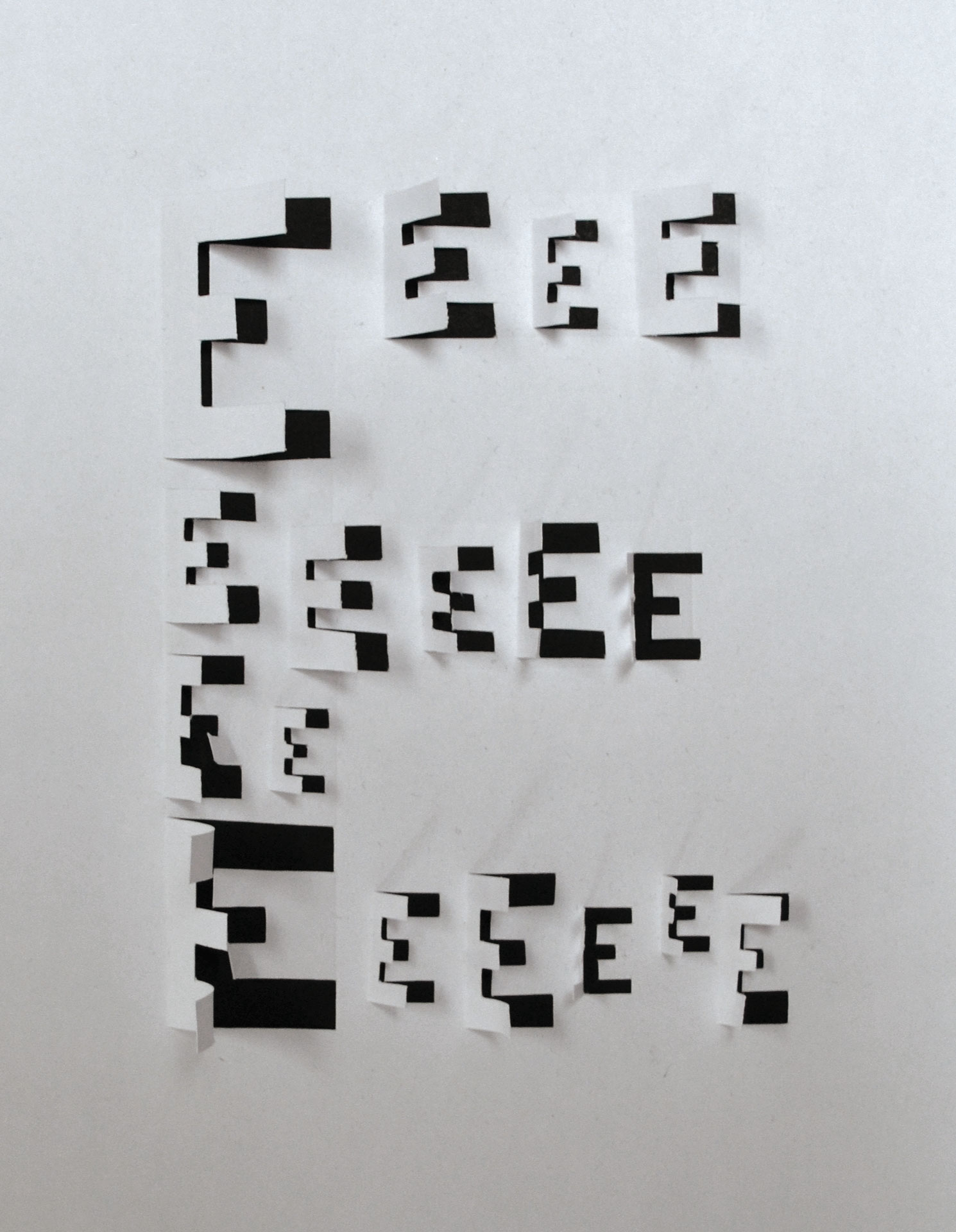
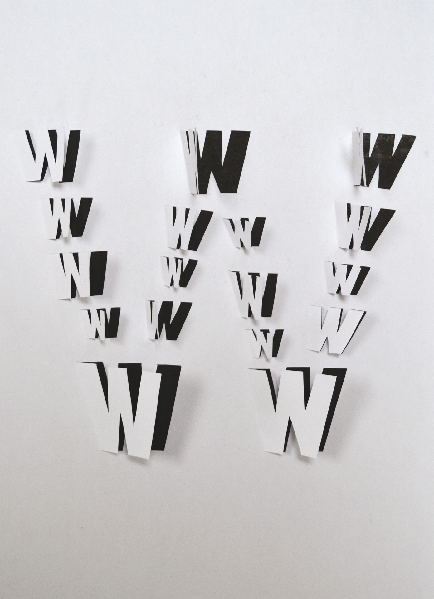
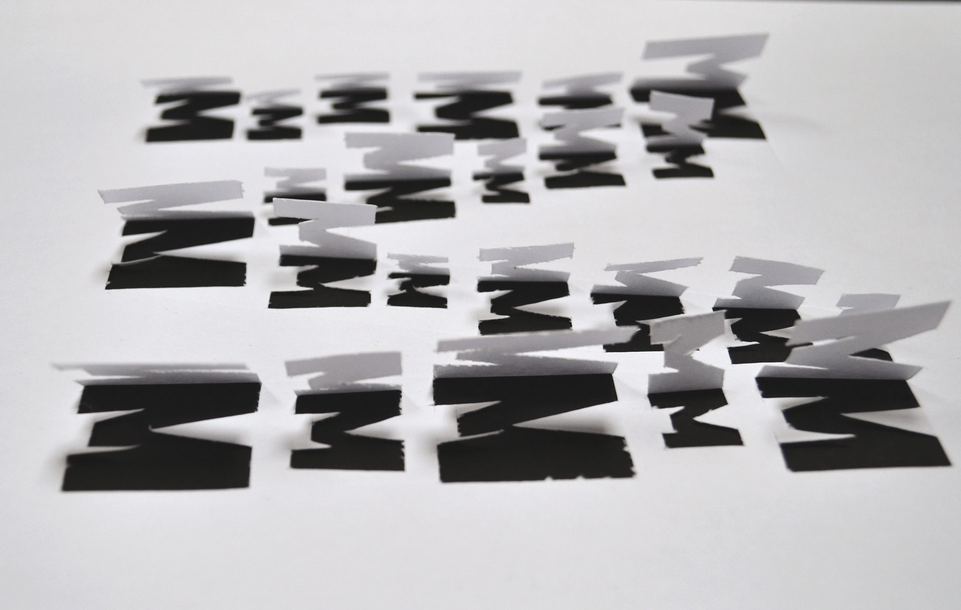
Letters Inside Letters paper alphabet
Letters Inside Letters paper alphabet
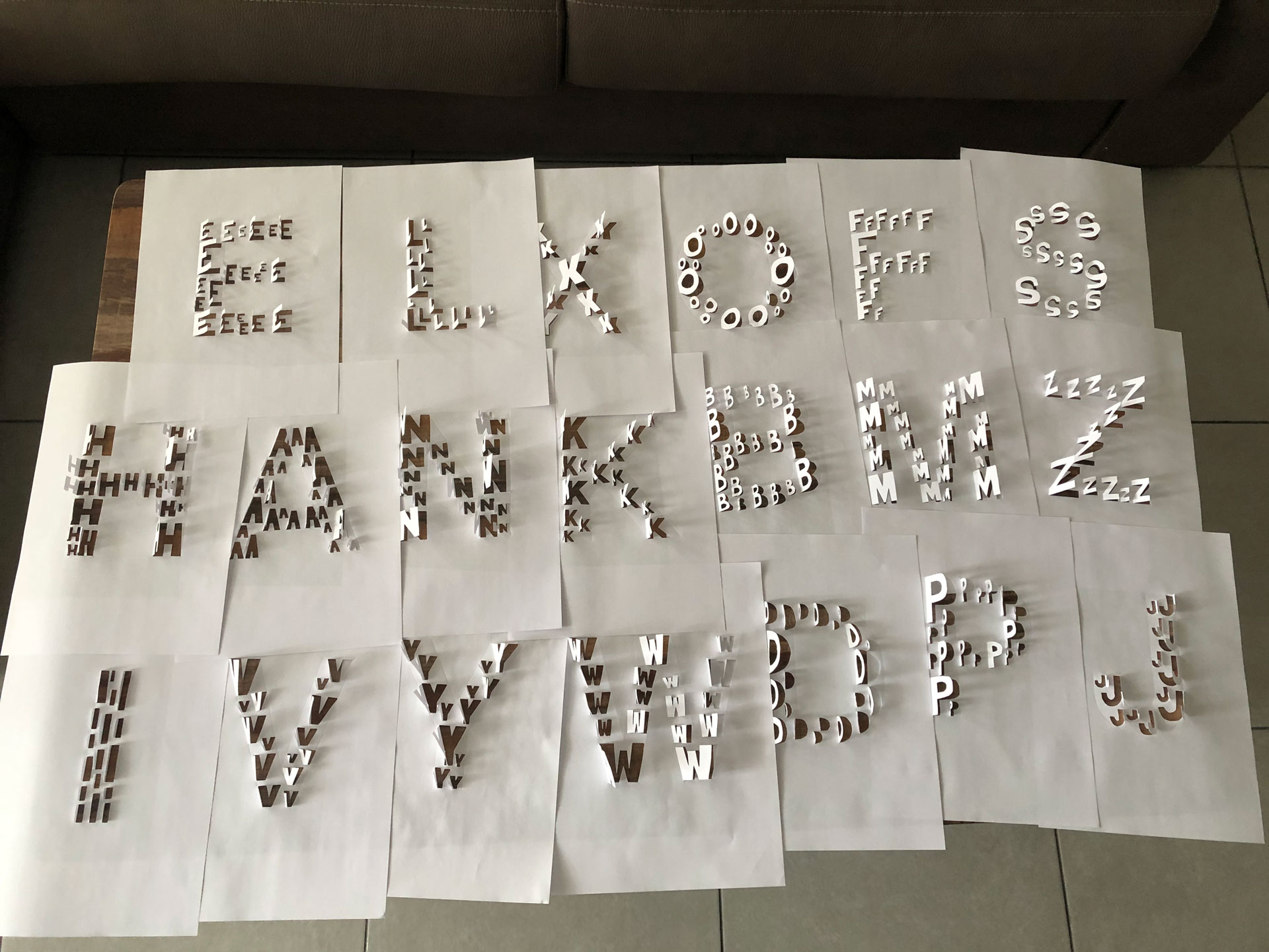
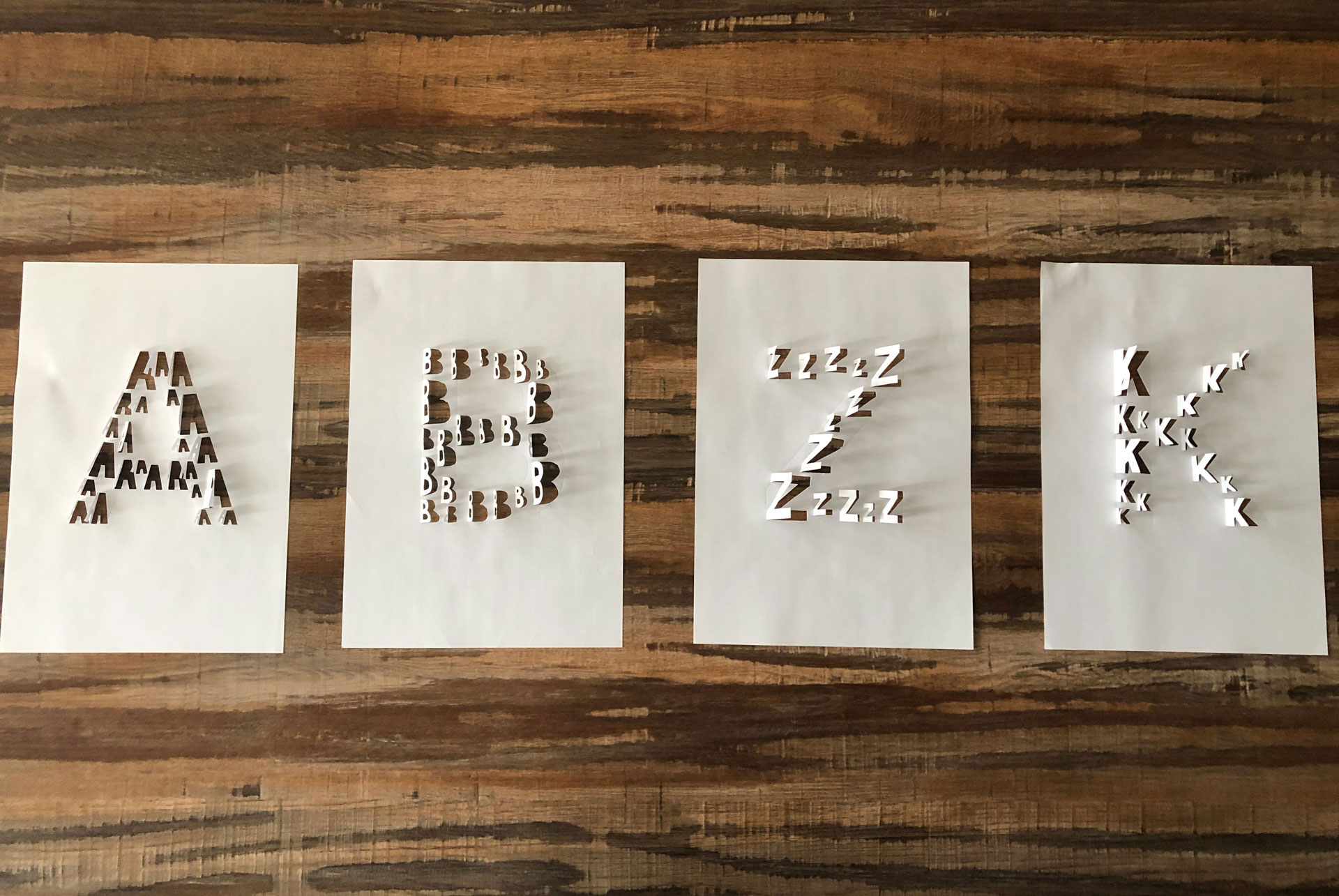
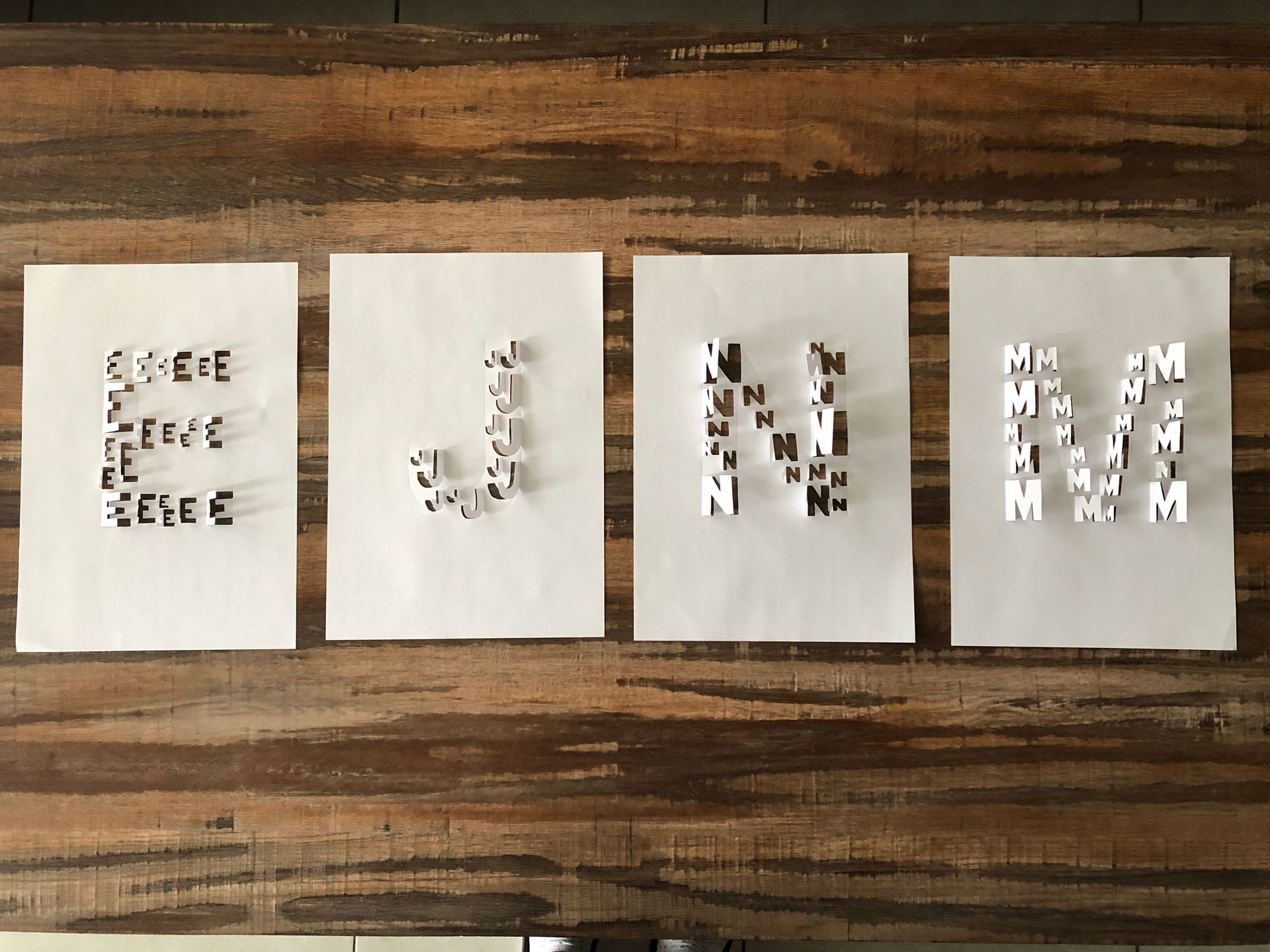
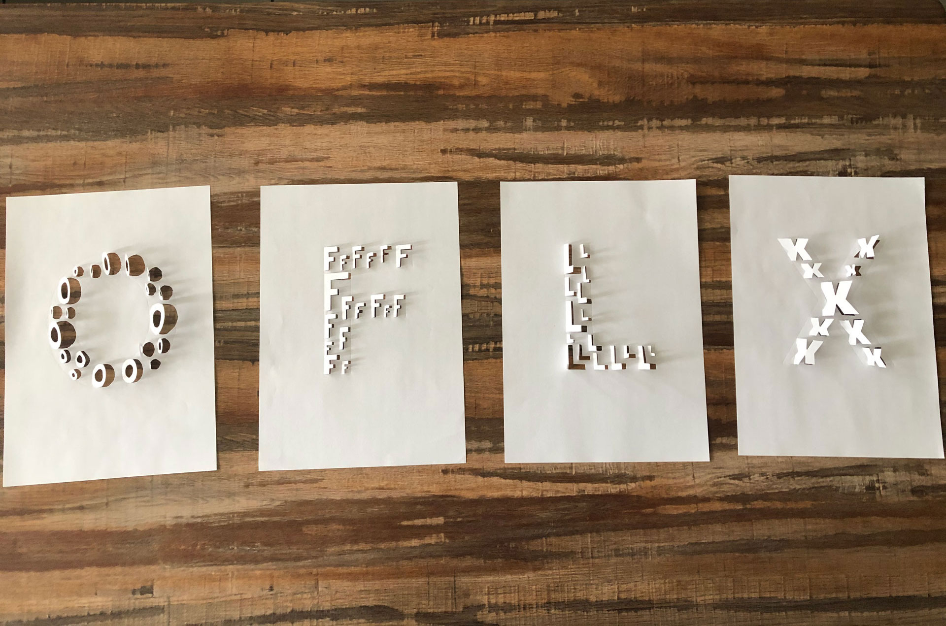
Evgenija uses small, cut-out letters to portray the design principle of repetition. Each of the letters is represented with smaller versions of themselves, cut out and slightly folded upwards, depending on the direction of the cut. The position of the smaller letters forms the shape of the actual letter by filling in the inside of the letter outlines.
This paper design is quite similar to the kirigami technique, hence it gives off the feeling of lightness and elegance. Additionally, it is a very time-consuming process which is a perfect opportunity for exploring paper and the letter to their fullest. The engagement and focus needed help the eye and the brain understand the shape and the feel of the paper on a higher level
Project designed by Evgenija Panevska
